Client
Moriya Garti - More Than EventServices
Brand Identity, Layout Design, Collateral Design,UI/UX and Web Development 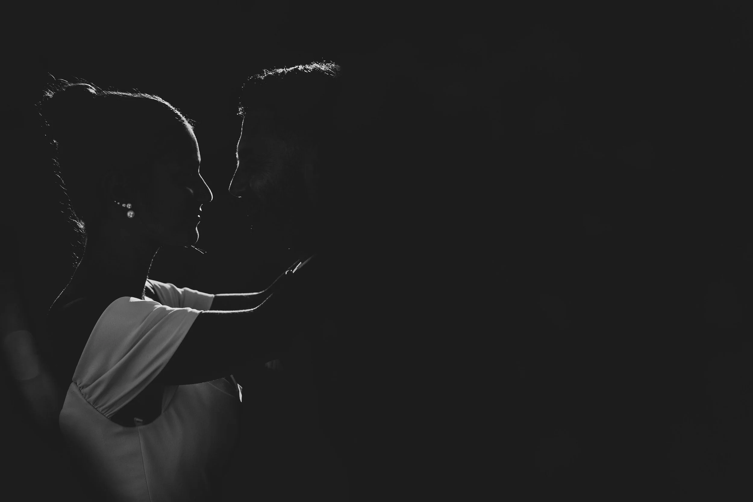
Timeless Style, Effortlessly Chic.
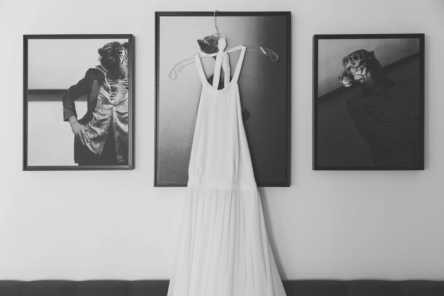
The brand strategy for "More Than Event" was designed to reflect the company’s commitment to professionalism, exceptional service, and attention to detail. The visual identity exudes a super high-end, classic, and elegant feel through a minimalist black-and-white approach.
This timeless color palette conveys sophistication and luxury, perfectly aligning with the brand’s ethos of delivering top-quality event planning and production.


Showcasing Perfection Through High-Resolution Visuals

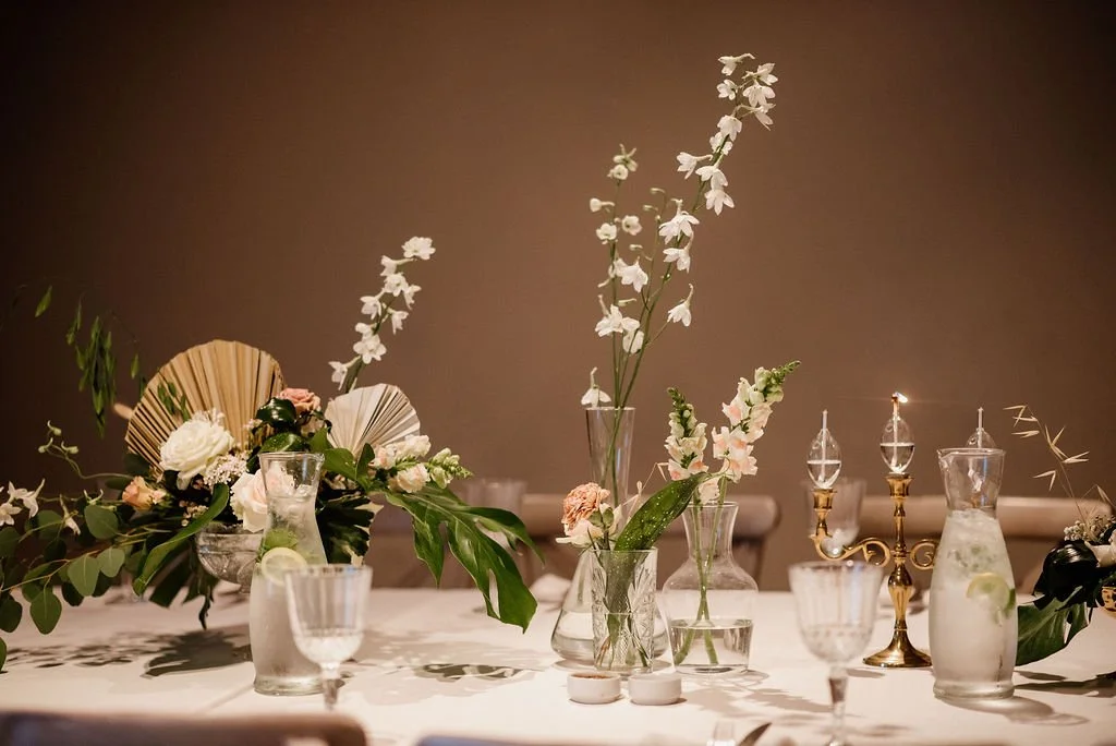
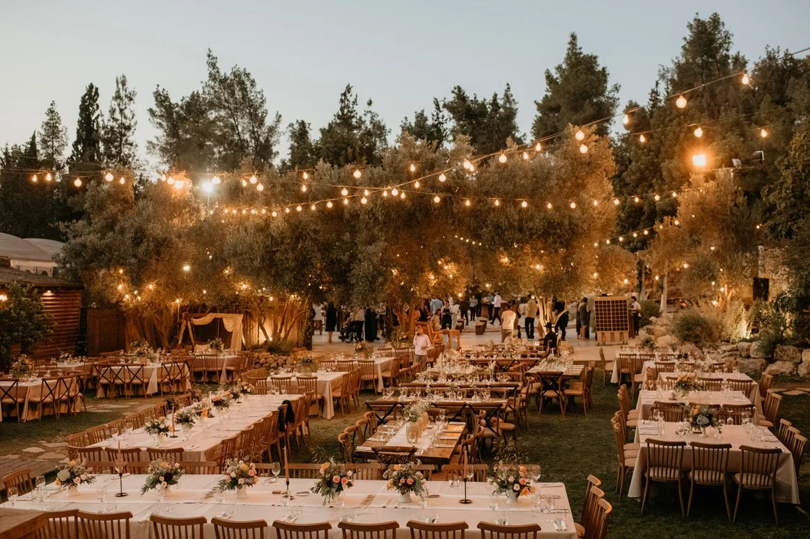
High-resolution photographs featured prominently in the visual identity showcase the company’s exceptional execution and ability to manage even the smallest details with precision and care. These visuals not only highlight the aesthetic perfection of past events but also build trust and confidence in the brand’s capabilities.

Typography That Balances Refinement and Readability
To complement this look, the brand employs a combination of serif fonts for headers, giving a sense of refinement and tradition, paired with a neat and highly readable semi-serif for supporting text. This typography pairing creates a balance between elegance and clarity, ensuring that the brand feels upscale yet approachable


An Online Experience That Reflects Luxury
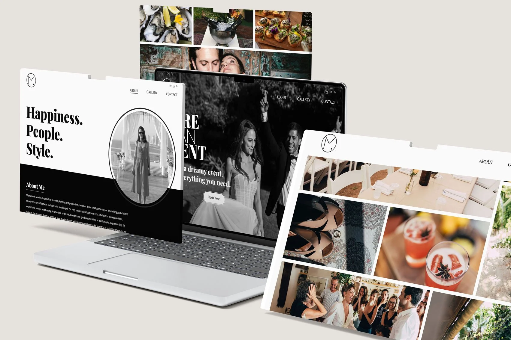
The website design was crafted to reflect the brand’s high-end image through a custom UX/UI approach that seamlessly integrates unique imagery and sophisticated layouts. High-resolution visuals are strategically used throughout the site to highlight the company’s meticulous attention to detail, showcasing its ability to flawlessly execute every aspect of an event.
This thoughtful design elevates the brand’s aesthetic appeal while providing an elegant and immersive user experience.